Design system · investment banking · sole UX designer
Solid Design System —
documentation, patterns, launch page
The components were nearly finished. The next job was writing down how to use them, and giving the bank's product teams a reason to.
Context
The Solid Design System is a framework-agnostic, token-based component library built to hold a large investment bank's products together. When I joined, most components were well into development and the engineering side was in good shape.
What existed was written for developers, which made sense given who'd been building it: specs, properties, values. What didn't exist yet was the layer that tells a designer when to reach for a component, why it behaves the way it does, what happens at the edges. And across the bank, product teams were still solving the same problems separately, because nothing yet told them a solution already existed.
Approach
01
Learning a system I hadn't built. This was my first design system of that size, so I read a lot. The components. How other design systems structure their documentation. And how the bank's older components had actually been applied across its products, which turned out to be the most useful part, because it showed me which inconsistencies were accidents and which were teams working around something the system hadn't covered.
02
Asking the people using it. I surveyed designers and developers about where the documentation let them down. Not what they thought it should contain in principle, but what had cost them time recently.
03
A language for the documentation. From that I defined how each component gets written up. What an entry contains, how things are named, where accessibility notes go, how edge cases are handled. The aim was that someone joining in two years could add a component without the whole thing drifting.
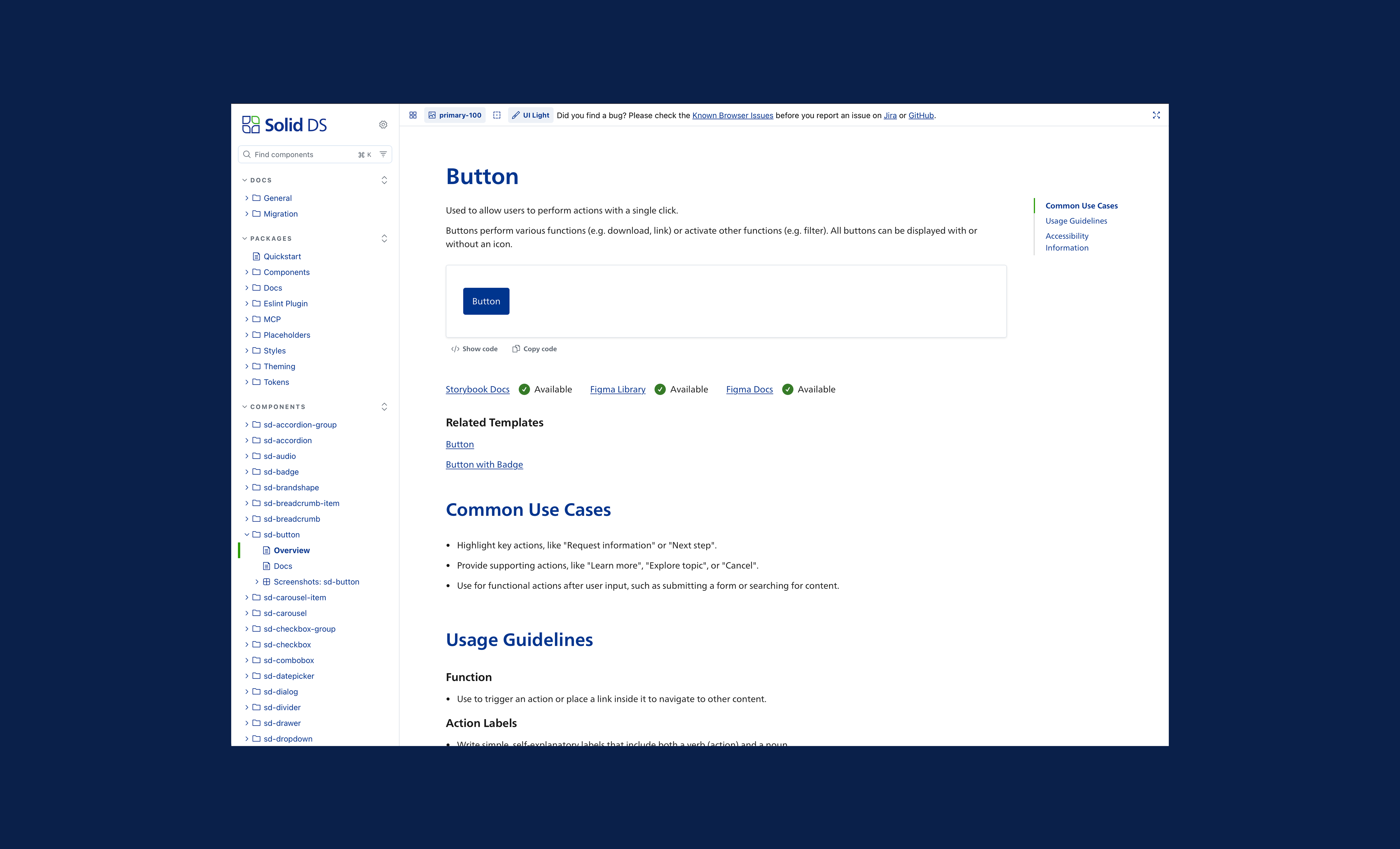
↑ Component documentation page in Storybook, the structure I defined
04
A disagreement with the client. Phase two was a pattern library, and the client's first idea was ready-made blocks, a form, a search bar, a navigation, that teams could drop in. I thought that would age badly across so many products. Prescriptive blocks tend to get used where they don't fit or not at all. We went back and forth on it over a couple of sessions.
Their starting point
Pre-built blocks. Quick to ship, easy to adopt, and a fair thing to want.
Mine
Document the function and the logic, let teams decide the layout.
We met in the middle. Patterns grounded in research across their actual products, written loosely enough to survive different contexts.
05
Finding the patterns. I went looking for where teams had independently built the same thing, then talked to stakeholders to check my reading and to catch the patterns obvious to them and invisible to me. Forms, search, navigation, first-time user flows, data visualisation, some others.
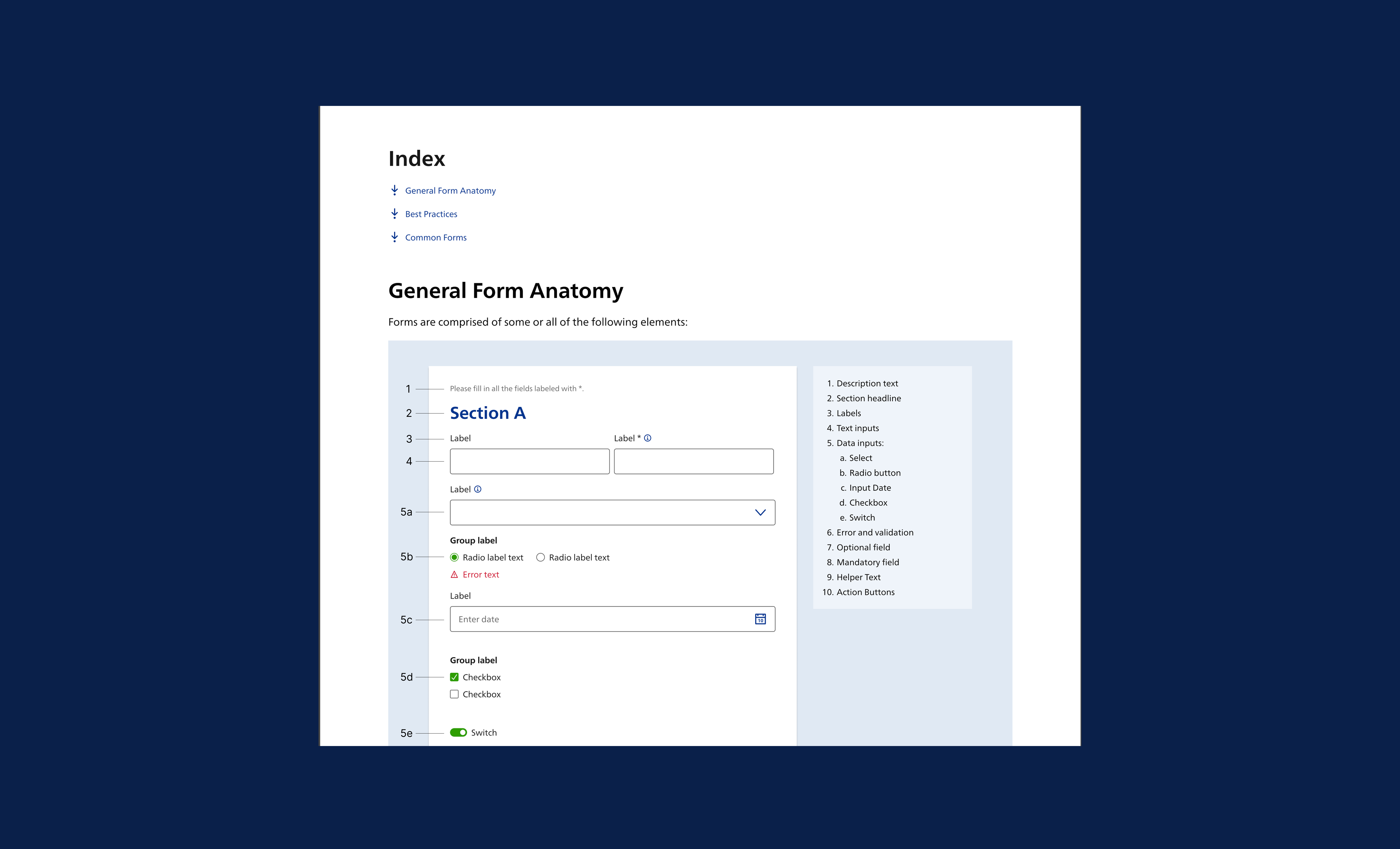
↑ Pattern definition, Forms
06
The landing page. With a visual designer, I wrote the narrative for the system's public page. The audience was internal teams who hadn't adopted the system yet, so the job was to make the case for it.
01
Values
What the system stands for, before any feature
02
Workflow
How design and development get faster together
03
Sustainability
Less rebuilt, less shipped, less energy
04
Stakeholders
One argument each for product owners, designers, developers, brand
05
Experts
The design system team as a service you can call
06
Release notes
The page as a living channel, not a brochure
The sustainability section was the deliberate choice. Design systems usually get sold on speed, and speed is a weak argument to a team that's already busy. Fewer components rebuilt means less code, less bandwidth, less energy, and the page itself was built lightweight enough to make the point.
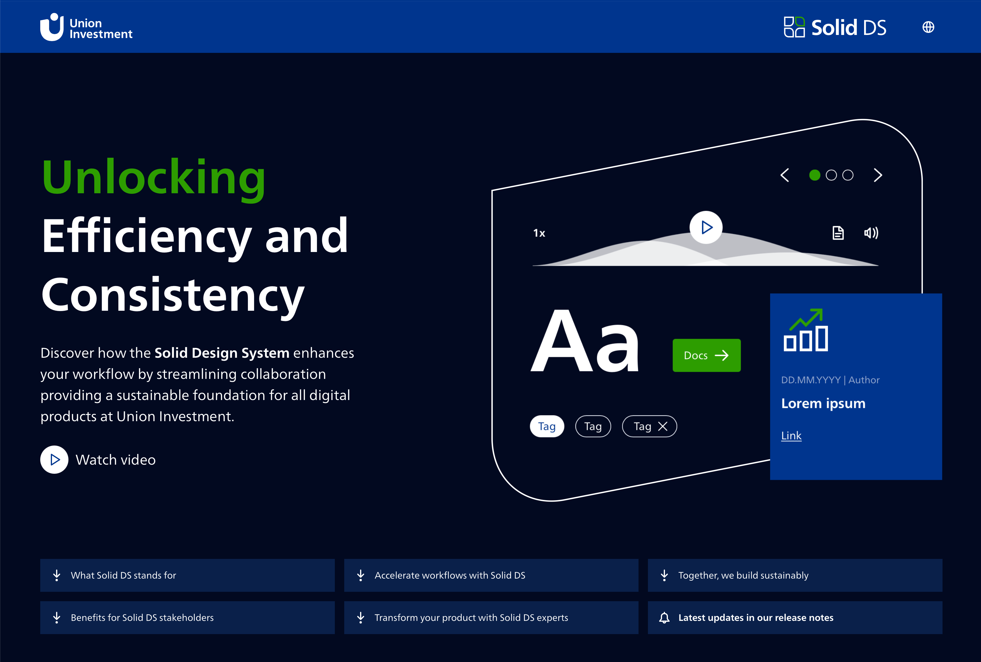
↑ The public landing page
What I contributed
Documentation language
A structure other people could keep adding to.
Research
Cross-product audit, surveys, a look at how other systems handle the same problem.
The pattern library argument
And a compromise both sides could work with.
Landing page
Showcase ofthe system targeted at teams who hadn't adopted it yet.
Outcome
Shipped
the documentation framework became the standard for everything added afterwards
2024
UX Design Awards nominee
Live
the landing page is public
View the live landing page: solid-design-system.union-investment.de ↗